Native vs Web, Mobile vs Desktop
A more detailed take on plaform and OS differences.
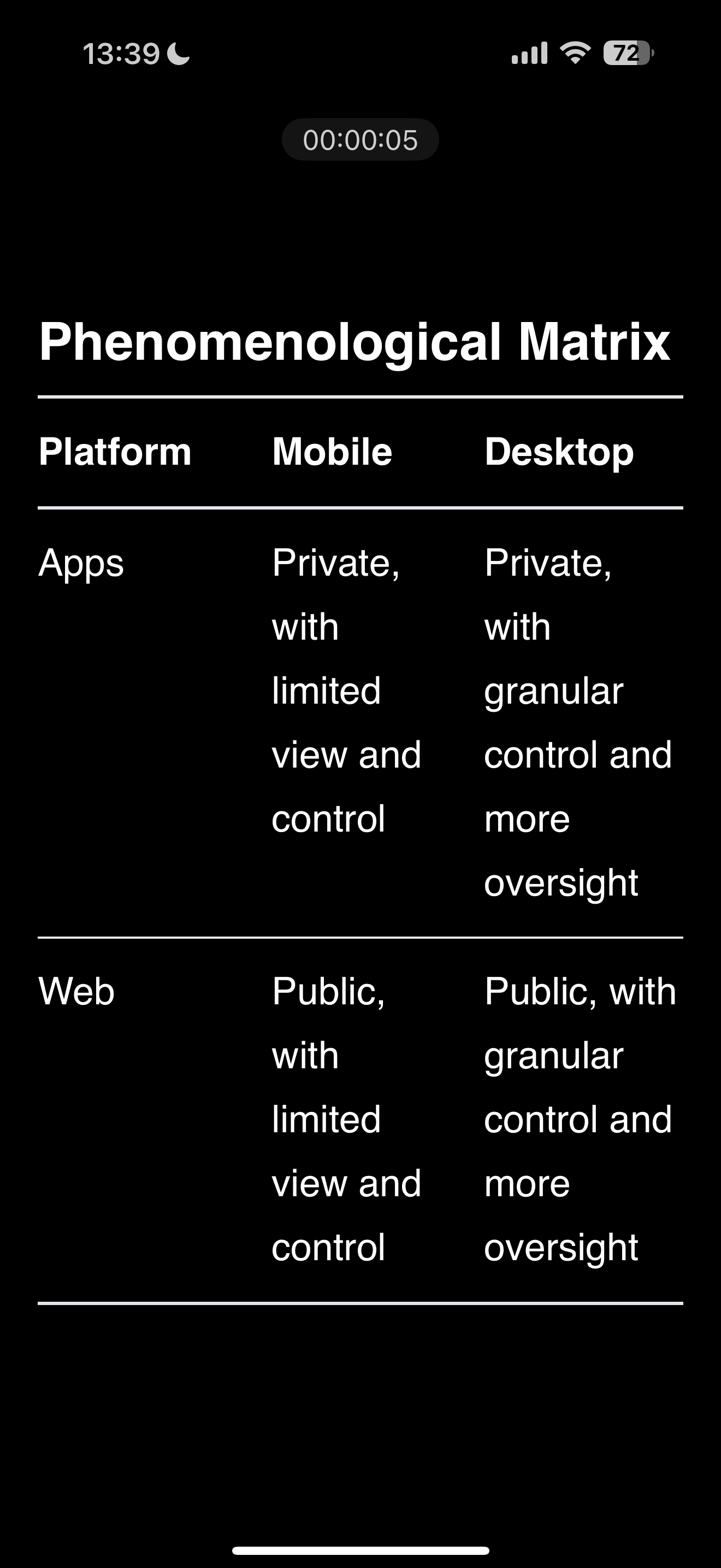
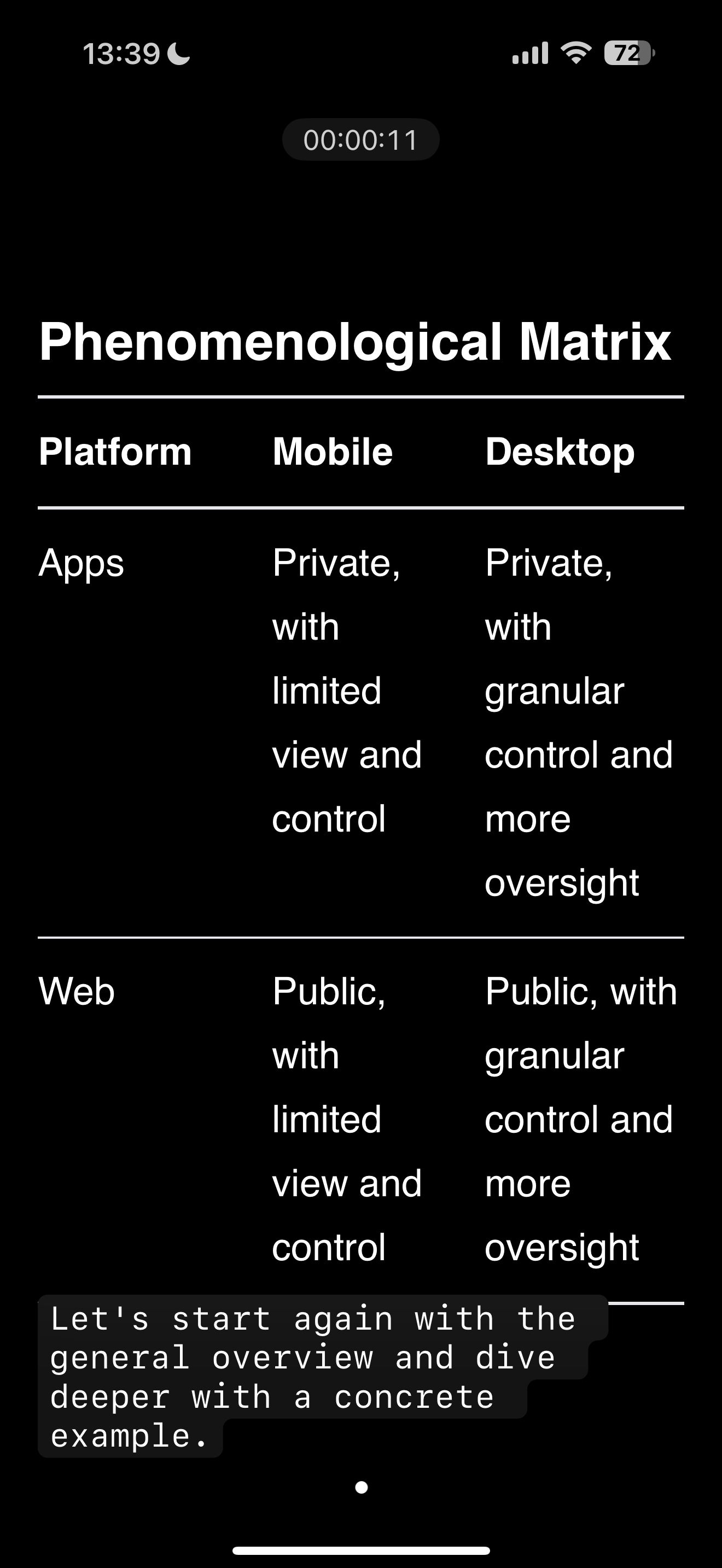
Phenomenological Matrix
| Platform |
Mobile |
Desktop |
| Apps |
Private, with limited view and control |
Private, with granular control and more oversight |
| Web |
Public, with limited view and control |
Public, with granular control and more oversight |
Let’s start again with the general overview and dive deeper with a concrete example.
Websites
- Less screen real estate
- One frameworks
- OS-independent design expectations
- Typically lower performance
- Framed by browser UI
- More volatile
- In close proximity by other sites and services
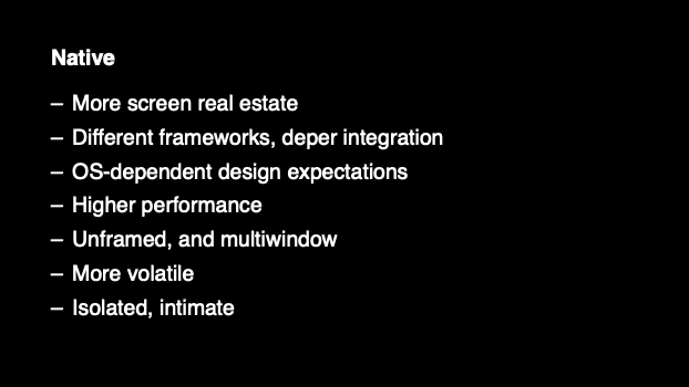
Native
- More screen real estate
- Different frameworks, deper integration
- OS-dependent design expectations
- Higher performance
- Unframed, and multiwindow
- More volatile
- Isolated, intimate
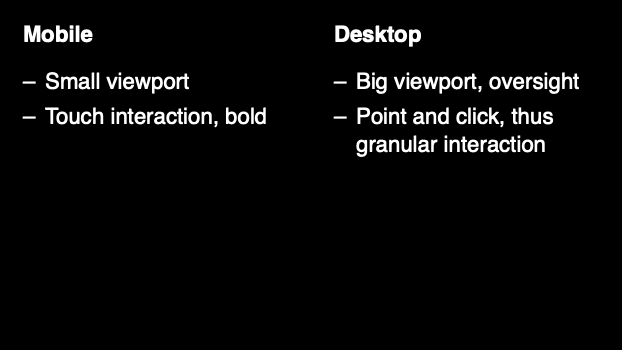
Mobile
- Small viewport
- Touch interaction, bold
Desktop
- Big viewport, oversight
- Point and click, thus granular interaction
Let’s see an example
Mobile vs Desktop
This is a presentation app in view mode. On the left you have the teleprompter. On the right you have the slide.
What do you see that’s device/platform specific for desktop native?
Answer: Multiple windows, somewhat standard horizontal, windowed viewport, high performance, high granularity, deep OS framework integration, platform standards for UI elements.
This is how it looks on a phone. Well, actually this is not how it looks on a phone by default.
Because the default orientation is portrait mode:
Let’s compare: As you can see, now, there is only one window, so where do we put the teleprompter?
Multiple windows become layers: Use subtitles.
Mobile vs Desktop Native: Mostly a fight against limited space and less granualr control
2. Web Desktop and Native